After purchasing and connecting the projector, you need to calibrate it. The reason for this is that often the image at standard settings is far from ideal. A properly configured device allows you to view all available content in much better quality. To avoid wasting time and money on calling a technician, you can do the setup yourself. The result of correct calibration of the projector will be a significant increase in the quality of images and output information in general.
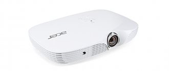
Choosing a good device can also have a significant impact on the quality of the final footage. Tested, certified devices are projectors from the following companies: epson, wzatco, benq.
It is not recommended to use devices that come to our markets from China, since they are often consumer goods.
Settings to configure
How to set up the projector? The answer to this question will be given below.
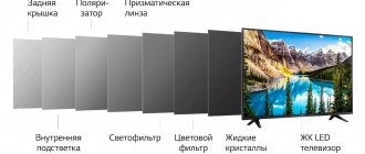
There are several types of projectors. These devices may differ in the principles of reproduction of the necessary content and the quality of it. The standard list of characteristics and settings may differ depending on the manufacturer. Calibrating your projector will help you achieve the best image and video quality if it doesn't initially meet your expectations.
Fine-tuning the projector is a painstaking process that requires care and concentration on this delicate work. To set up your projector, you will need some tools, such as dedicated software, an image to serve as a reference, a colorimeter, and a spectrophotometer.
The recommended calibration sequence is as follows:
- Sharpness indicator (adjusted first, as this will help in setting further indicators and parameters)
- Purity of images (prevents various inaccuracies in image transmission and possible interference)
- Color accuracy
- Image and video contrast ratio
- Resolution of the output projection
Changes in the level of color gamut also have a certain sequence:
- Contrast of dark and light tones
- Grayscale Pickup Areas
- Color spectrum
To properly improve the operation of the projector, it is strongly recommended that you contact a specialist, but if you wish, you can do it yourself. During the setup process, you may need some highly specialized knowledge and specialized, rather expensive, equipment. Paid software can provide you with a wider range of customization options, but for the first time you can use free software.
The main task of testing a projector is to establish its real characteristics as opposed to the declared characteristics, to determine the strengths and weaknesses of the device in comparison with analogues available on the market. During testing, it is important to talk about such points as the ease of use of certain additional functions of the projector - were they added for people, or, as they say, “for show”?
However, the main object of any testing is the image . Of course, image quality can be described in simple language, but this language is subjective. For example, you won't be able to find fault with conclusions that say the projector's colors are "very saturated" - as they say, "I'm an artist - that's how I see it." But you can’t argue with the measurement data (including colors).
Therefore, I believe it is beneficial for the end user to be able to extract from the descriptive text real, objective characteristics of the projector that they can rely on. Oddly enough, the manufacturer himself will greatly benefit from the buyer’s awareness, as he will be able to talk about the real advantages and unique advantages of his projectors. Using adequate testing techniques allows you to not only compare projectors that have been reviewed by one person. If the testing was done in good faith, then the measurement data can be compared with data from other sites. Personally, I read many English-language tests, and sometimes in other languages using online translators, and very often I get the feeling that I am speaking “the same language” with the author - I pay attention to the same shortcomings, I get the same numbers...
Updated March 17, 2021: Added video about projector calibration (Part 1)
Updated February 11, 2021: I recommend studying the material Projector Modes - An Introduction to Color Rendering , which is intended as an introduction to this publication.
1. Adjusting “brightness” and “contrast”
In the image settings of any display there are these two adjustments, which are not directly related to the declared brightness or contrast characteristics of the projector. When we display a test image with a smooth or stepped transition from black to white, reducing the " brightness " reduces the brightness of the blacks. The goal is to make sure the black is the darkest the projector can produce. If you reduce the “brightness” more than necessary, then the black will begin to merge with the dark gray. This results in a loss of detail in the shadows.
The photo shows a screenshot from the projector screen, which displays an image for adjusting the “Brightness” parameter.
If you don't reduce the "brightness" enough, there will be no loss of shadow detail, but blacks will be brighter than the projector could display. Subsequently, when measuring the projector contrast, this will lead to an underestimated result.
This is a little confusing because the "brightness" setting controls the color black, which is usually associated with projector contrast.
The “ contrast ” parameter, in turn, is responsible for the maximum brightness of the white area of the test image. The "contrast" needs to be increased until we get the brightest 100% white the projector is capable of. If you increase the contrast too much, the brightest white will begin to merge with less bright shades and there will be a loss of detail in the highlights. If the Contrast setting is insufficient, the projector will not achieve the maximum brightness it is capable of, and this will result in an underestimated result when measuring contrast.
Below are examples of incorrectly and correctly configured “contrast”; In the bottom image, all luminance gradations are visible, while in the top image, several gradations are lost.
The “brightness” and “contrast” parameters may or may not be initially configured correctly. Very often, “contrast” is overestimated in bright projector image modes, giving an unreasonable increase in brightness during measurements. That is why adjusting the “brightness” and “contrast” parameters using the test image is necessary before measuring the luminous flux of the projector.
It can also be noted that in some cases a projector or monitor may produce more significant color rendering errors closer to maximum brightness. For example, starting from 95% brightness the hue changes sharply. Sometimes, to achieve the best results in terms of color reproduction, you have to “cut out” these bright areas using the “contrast” setting, but this has more to do with customizing the projector for yourself than with testing its capabilities.
Luminous flux measurement
Measuring the luminous flux, according to the ANSI method (ANSI brightness, ANSI lumens - synonyms for ANSI luminous flux), involves at the first stage measuring the screen illumination at 9 points.
A 100% white image is displayed on the screen, a light meter sensor is applied to each of the 9 points, directed at an angle of 90 degrees from the screen towards the projector (in this case, as a rule, the sensor is not directed strictly towards the projector lens due to the fact that the lens is located below or above the center of the screen). The resulting 9 illumination measurements are averaged and multiplied by the screen area in square meters - the maximum luminous flux of the projector in lumens is obtained.
In the pictures: a white screen with marked places for attaching the sensor. You can tell by the tint that the “Presentation” mode is on on the left, and the “Dynamic” mode on the right.
According to the ANSI method, the “contrast” parameters are adjusted before measurements using a test image with a brightness step of 5%: 90%, 95%, 100%. I try to use finer gradations as if I were customizing the image, so I end up with a slightly lower brightness value than the ANSI method.
Obviously, measurements are taken with external lighting turned off and sunlight blocked as much as possible.
When measuring illumination, I use a Chauvin Arnoux CA 811 luxmeter.
Measuring "Color Brightness"
Measuring color light output, or “Color Light Output,” comes down to getting the average red screen illuminance, the average green screen illuminance, and the average blue screen illuminance. By adding these three numbers, we should ideally get something close to the average illumination of a white screen. By multiplying the resulting amount by the screen area, we get the desired “color brightness”.
This parameter is associated with the idea that traditionally white color is formed by the simultaneous glow of red, green and blue “pixels”, be it a CRT or LCD TV. If the sum of the brightnesses of red, green and blue is less than the brightness of white, then the colors will be dark.
The correct technique for measuring color brightness involves using three test images, each divided into 9 equal parts of red, green or blue. By using three images for measurements, it is possible to take measurements of each of the three colors in each of the nine sectors of the screen. After taking measurements, the obtained values for each individual color are averaged and the average illumination of red, blue and green is obtained. These three numbers are summed up and the desired “color brightness”, or “luminous flux by color” in lumens is obtained.
However, I must admit that I usually use a simplified technique for measuring color brightness. As a rule, I take a point in the center of the screen and measure white, red, green and blue there, after which I get the ratio of the sum of red, green and blue to white, directly by illumination, without converting to lumens. This is quite enough to use “color brightness” for its intended purpose, that is, to quickly identify gross violations of color rendition by the brightness of colors. For example, if I receive color brightness as “75% of white”, “40% of white”, or even “30% of white”, I simply conclude that “in this mode the projector displays too dark (dull) colors” .
The color brightness setting varies depending on the projector's picture mode and, in the case of single-panel DLPs, the "BrilliantColor" setting, which allows you to reduce the maximum (white) brightness to color brightness if you need higher accuracy, or not do so while maintaining gain white relative to flowers.
It often happens that the “color brightness” turns out to be about 10% greater than the maximum (white). This is a normal situation, and final data on color brightness can be obtained at the stage of measuring white balance or individual primary colors. The purpose of color brightness is not to accurately assess color rendering; it allows us to identify strong discrepancies between the brightness of white and colors.
Contrast measurement
ANSI contrast is designed to display a checkerboard pattern on the screen. Since the white color from this very “chessboard” is reflected from the walls and falls on the black squares, it is difficult to be sure of the consistency of the results, even if you want to. In addition, I’m currently gluing wallpaper, so today the light will be reflected from the light drywall, and in a week from the black wallpaper, and someone will get an undeservedly higher ANSI contrast.
That is why I carry out contrast measurements exclusively using the “sequential method” - separately on the black and white screens. When displaying a black screen, the effect of reflection from the walls is practically absent.
I first measure the illuminance at the center of the white screen, placing the sensor as close to the projector as possible to obtain illuminance close to the upper limit of the sensor's sensitivity. Typically this is about 15,000 lux. Then, without changing the location of the sensor, a black image is displayed on the screen and a measurement of the black illumination is taken. By dividing the illuminance of white by the illuminance of black, contrast is obtained.
This contrast comes in two forms, depending on the projector settings:
1. Dynamic contrast. The projector has auto iris enabled, if it has one.
2. "Real contrast." The projector has all functions that can darken blacks disabled, including auto iris and smart eco modes that regulate lamp brightness.
The most important parameter is the second parameter, “real contrast”, while dynamic contrast is published as an addition to evaluate the usefulness of auto iris. Contrast measurements are taken separately for the brightest and most accurate color mode and vary greatly in favor of the first. Since in the dark, where contrast is important, the most accurate mode is used, it can be argued that no projector can present its maximum contrast.
If the sensitivity of the lux meter is not enough and when increased accuracy is required when measuring black (for example, when working with High-End projectors), contrast is measured as the ratio of the luminous flux in white to the luminous flux in black. In this case, the black image is projected onto a pre-prepared miniature screen, on which the black color will be bright enough to obtain an accurate illumination value. This illumination is multiplied by the area of the screen, turning into luminous flux on black, but how luminous flux on white is measured has already been said.
When measuring black in this case, the sensor is not applied to the screen, since this would bring it much closer to the lens, significantly increasing the resulting illumination value. Instead, it is built into the screen, being flush with its surface.
The necessary conditions for contrast testing are the complete prevention of sunlight from entering the room - the background illumination is less than 1 lux, but in reality it is much less.
In the future, it probably makes sense to move on to measuring contrast, when the background brightness is subtracted from the brightness of the black image. This is especially important when working with home projectors that potentially provide deeper black levels.
The second condition for measuring contrast is the correct setting of the “brightness” and “contrast” parameters in the projector menu. However, recent experiments have shown that it probably makes sense to reduce the "brightness" parameter when measuring projector contrast below what is necessary, since the eye does not always accurately determine whether the minimum black level has been reached.
Brightness Uniformity Measurement
If I provide data on the uniformity of brightness distribution across the screen, then we are talking about light measurements at 9 points. This data is obtained by measuring the luminous flux on white.
For example, the illumination values obtained are:
| 1402 | 1731 | 1507 |
| 1614 | 2030 | 1866 |
| 1803 | 1960 | 1850 |
The minimum and maximum values are taken and the first is divided by the second.
Uniformity corresponds to 1402/2030 = 69%. The image in the top left square was 31% less bright than the one in the center.
In this case, the presence of a light spot is obvious - the center of the image is brighter than the edges.
However, there are also controversial situations. For example, ultra-short throw projectors. If such a projector is placed on a table, then the angle of incidence of the rays in the lower central square is closer to 90 degrees, and the angle of incidence of the rays in the upper square is closer to 45 degrees.
If the screen has a glossy property, then it is advisable for such a projector to produce less illumination in the part of the screen that is located opposite the lens and more illumination at the edges of the screen. Of course, different screen material in this case will give different uniformity of brightness perceived by the viewer.
Measuring the brightness of a color gradient
I said that before measuring maximum brightness over white, you need to make sure that the projector’s image parameter “contrast” is set correctly and allows you to display a smooth black-and-white gradient with distinguishable shades in the 100% white area.
Let's say I turned the brightness down to 80% of maximum, got a great black-and-white transition, and then displayed a black-and-green image on the screen. And, horror of horrors, the details of about 100% green are again indistinguishable!
To properly adjust the image, you have to reduce the “contrast” until the transition from black to green becomes continuous (in this case, I propose to consider black as dark green with a brightness of 0).
In general, experience has shown that for some projectors the adequacy of the black-color gradient is achieved only after a significant reduction in maximum brightness.
And note: this is not the same as color brightness. If the projector has a color brightness of 30% of maximum, but 95% red is different from 100% red, then everything is ok.
I started paying attention to this parameter after I heard accusations against 3LCD projectors that they have high color brightness, but the color shades are indistinguishable around 100% brightness. Then it turned out that this problem actually exists in most budget projectors and does not depend on the technology.
This happens mainly in the brightest mode of the projector, where manufacturers try to squeeze out more brightness at the expense of color reproduction, which is quite normal - otherwise projectors would not have different image modes that give a 2-fold difference in brightness.
Gamma measurement
The gamma function is affected by a number of projector settings, so it is useful to have a separate tool for a quick estimate and a separate one for an accurate and final estimate.
In the picture: we raise the left row to the power of 2.2 (red line in the diagram).
The projector outputs a gray image with brightness ranging from 0% (black) to 100% (white) in 10% increments. The real brightness of the image on the screen grows nonlinearly - at first slowly, and after 50% it accelerates sharply. Ideally, the resulting curve should correspond to the function y=x2.2, or y = x2.4. For example, a gamma value of 2.2 is more desirable in very low light conditions, such as light reflected off white walls. The 2.4 indicator is suitable for a home theater with completely darkened walls. Well, in a lit room the indicator may be less than 2.0. And there is also the BT.1886 standard, in which the curve will first be closer to 2.2, and approximately 50% will be closer to 2.3 and higher.
In the picture: we added a 3rd row with measurements of screen illumination in lux at brightness from 0% to 100%. In the 4th column, we converted this into a percentage of maximum brightness and added it to the diagram as a purple line. Conclusion: the projector has an almost perfect gamma of 2.2.
A high gamma value creates a more contrast effect, making the dark areas of the image darker, but in the light they will be difficult to distinguish. A low gamma value makes shadows more visible, but produces less contrast.
For quick measurements, I use Chromapure, which is also where I do all my other color measurements. As a measuring tool, together with the program, I use the X-Rite Eye One Pro spectrophotometer. Its disadvantage is low accuracy when working with low-brightness images.
To make an accurate measurement, I use a lux meter in much the same way as when measuring contrast, but instead of measuring at 0% and 100% brightness, all gradations are taken in 10% increments. Next, in Excel, the results obtained are lined up into a curve, which is compared with standards in the gamma of 2.2 or 2.4 (y = x2.2 or 2.4). A conclusion is made about the gamma and, if it is not close to the reference one, the power function exponent that is closest to the result obtained is called, for example, “2.2 to 50% brightness, then 2.4.”
Graphically, the gamma function can be represented as the signal level along the x-axis and the brightness level (illuminance, luminous flux - it doesn’t matter) along the y-axis.
Or the y-axis may not represent the brightness of the projector, but the gamma function indicator to which the resulting brightness corresponds. For example, a signal of 20% is gamma 2.2. Signal 50% - gamma 2.3. In this case, if the gamma coincides with a power function with one or another exponent, for example 2.2, which would be a good result, the graph will look like a horizontal line. This display method is convenient to quickly say in which section the gamma function corresponds to the power function with what exponent, without drawing the corresponding additional graphs.
In the picture: Chromapure program, White Balance tab (greyscale). By displaying shades of gray from 0% to 100% in turn, not only the brightness was read with a spectrophotometer, but also divided into basic colors. At 0% (black), the spectrophotometer obviously could not see anything - it lacks sensitivity. The gamma index varies from 1.9 (20%) to 2.2 (90%). White balance is shifted towards blue. To correct the BB you need to lower the green and blue levels. The combination of green-blue tint and relatively low gamma may be a sign of Presentation mode.
White balance measurements
For all color measurements I use an X-Rite Eye One Pro spectrophotometer and Chromapure software.
Chromapure generates images from 0% (black) to 100% (white) brightness in 10% increments, taking measurements automatically. The program then decomposes the resulting color into red, green and blue components, clearly demonstrating which color has more intensity than required and which has less intensity. For example, a lack of red gives the image a blue tint, a lack of blue gives it a yellow tint, etc. The scale offered by the program, on which the brightness of the primary colors is shown as a percentage of the norm, is quite sufficient; I usually do not pay attention to Delta E - to describe the result, a description of the deviations as a percentage of the norm is sufficient.
“Color temperature” is essentially a stripped-down version of “white balance” and considers deviations towards blue (cool) or towards red-yellow (warm).
Color gamut measurements
In 99% of cases you have to deal with projectors targeting the standard sRGB color space. Some projectors allow you to go beyond this, but do not meet any standard. To be honest, I have not yet dealt with home projectors compatible with content that requires a wider color gamut. Lately, there has been a lot of talk about the UltraHD Blu-Ray Rec.2020 standard, that some top-end projector models can accept this format and correctly display images in a narrower color space, close to DCI. In general, I have yet to come across these devices, but for now, the good old uncontested sRGB color.
ChromaPure takes measurements of the base colors and their derivatives - Red, Green, Blue, Magenta, Cyan and Yellow, as well as 100% white. The results are plotted on a CIE chart, allowing us to see deviations from the target hue and saturation values for each color.
My task is to point out the most significant errors. For example, a classic for office projectors is a slight shift in the shade of green towards yellow. By combining red, green and blue, we get the color gamut of the projector. It may not match sRGB in one color, or in all three. It may be narrower or wider than required. Finally, if red, green and blue match, additional colors - magenta, cyan and yellow - may not match.
The Color Gamut tab of the ChromaPure program also displays the brightness for each color in % relative to normal. This is the more accurate measurement of “color brightness” that we talked about at the beginning of this article. One color may be brighter than the standard, another darker. It is important to understand that the white balance can be adjusted perfectly.
The Color Management tab also shows the deviation from the target for each of the colors: Brightness, Saturation, Hue, and also Delta E (usually I use CIE94).
The most interesting tab is the Advanced Color Management, which displays not only the primary and secondary colors at 100% saturation, but also their versions at 25%, 50% and 75% saturation. These measurements are critical to understanding what is actually happening with color accuracy. The fact is that 100% saturated colors are used extremely rarely. Even if the projector is not capable of displaying the entire sRGB color space, if it can accurately display colors up to 75% saturation, we will be provided with a very accurate image with rare deviations when it comes to extreme colors.
The opposite case is when the projector displays the correct colors with 100% saturation, but chaos ensues inside the triangle. A common mistake in projector image calibration occurs when the user strives at all costs to achieve accurate shades of 100% saturated colors, without paying attention to how this affects colors with less saturation.
Image brightness
The luminous output of a projector is often called “brightness” - it’s simpler. However, the projector may produce different brightness levels depending on the screen surface characteristics and screen size. Brightness is measured in foot-lamberts, which in the metric system is converted to candelas per square meter (1 cd/m2 = 1 nit). In a dark room, it is considered that the brightness should be in the range of 12 to 22 foot-lamberts, sometimes called the ideal brightness of 14 or 16 foot-lamberts. I'm targeting 16 foot lambert. I use a spectrophotometer as a measurement tool.
As a rule, I use brightness only to report the screen size achieved at optimal brightness. The need for this arose due to the fact that the image may look “very good for its class” and other subjective formulations, even if its brightness is significantly less than the recommended norm. Therefore, I try to report the screen diagonal of a home projector obtained using a “standard matte screen” at 16 ft-lambert brightness.
11. Color calibration
Calibration is a topic for a separate article. In general terms, calibration for a home theater may consist of the following steps:
- Finding the Most Accurate Picture Mode
- Adjusting the “Brightness” and “Contrast” parameters, selecting the optimal gamma, BrilliantColor mode, color temperature.
- Adjust white balance for red, green and blue. Some projectors use an offset/gain adjustment for each color, which may match the brightness and contrast for each color, or may give a less predictable result.
- If we are talking about a home projector and this is considered promising, then individual colors need to be adjusted (if the projector has a color management system). 100% Saturated Colors are adjusted in hue and saturation to achieve not only the perfect position of the 100% Saturated colors, but also everything inside the triangle.
Often when adjusting color you are faced with the choice of whether to “increase or decrease” a particular color to achieve the right balance. In general, we have to admit that with most projectors, when you magnify something, you risk getting it off scale, which you won’t immediately notice. For example, we got perfect color reproduction, but red is not bright enough. We go into the color management system, select Red and increase the brightness. And then it turns out that the gradations of about 100% red were lost when outputting a black-red gradient - it went off scale.
CalMAN ColorChecker
If you need to give an accurate assessment of the color rendering of a mid- or high-price projector, to compare two models, or to evaluate image calibration, you can use this tool. The program automatically takes about 100 color samples and displays the result in two numbers: the average Delta E error and the maximum Delta E error. The Delta E format can be either CIE94 or CIE2000. When the calibration software tells you everything is OK, ask CalMAN ColorChecker. This program will impose a final resolution and shatter all illusions.
How to calibrate your projector yourself
For a one-time setup, it will be easiest to use one of these methods:
- Manually adjusting the characteristics and parameters of the projector, starting from data that corresponds to the standard.
- Using the standard form of projector calibration in the screen properties, after connecting it to a computer or an alternative device that supports the ability to adjust the color gamut.
If you often view photographs (slides, presentations) with your family, then you can use the tools built into the Power Point program on your computer to improve the picture.
Simple adjustment of parameters to the standards specified by the manufacturer
Using this method, you can adjust the saturation, contrast, and blending of colors. As a sample, you need to use a test image supplied from a computer.
For better and more accurate settings, it is recommended to turn off additional light sources, which can cause inaccuracies and complicate the calibration process using improvised means. The projector must be set to Custom Setting mode.
Stages of determining priority characteristics
- First of all, we need to choose a picture that will serve as a standard for us. It is preferable to choose an image in both light and dark tones, which will contain medium-sized textures and small details.
- We reset the values of all parameters to the factory state.
- We select the values of the characteristics until the image on the screen matches the reference one.
- We adjust the brightness.
- We save the values when we achieve the desired result.
The following signs can be considered as criteria for correct settings:
- The eyes are not strained during long sessions of working with this screen and the image is projected evenly.
- Comparing the result with benchmark indicators, the values are close to ideal.
- The image reproduced by the projector does not have a harmful effect on the eyes at different distances from the screen.
Such work is always done by eye. The result is only the personal preferences of the individual. Sometimes, the characteristics obtained during tuning may not coincide with the standardized reference values specified by the manufacturer. However, this does not mean at all that they will not suit you and something should be changed. Start only from your own comfort.
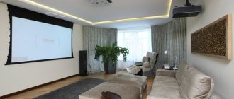
Installation
Before installing the product, be sure to read the documents that come with it. Each model of projection equipment has its own nuances. If you did not receive it out of the “box” and you do not have instructions, you can find them on the manufacturer’s official website.
You should not put devices with high resolution in a small room. The product has characteristics that must be considered before purchasing. Setting up a projector begins with choosing a location for it. It is better to look at the entire set of projection equipment in advance and measure the room in which you are going to put it. To calculate everything. Use the information on the manufacturer's website. Or look at the documentation for the device. It indicates the optimal distance to the wall and recommended screen sizes.
A modern projector is not a filmoscope for filmstrips that could be viewed on a “white sheet.” Although nothing prevents you from using the old proven method. But to get a high-quality picture and fully experience the effect of presence, you need a special screen. Its size largely determines how to install and configure projection equipment.
There should be a calculator on the manufacturer's website. There you need to indicate the screen characteristics and device model. And get the recommended distance from the projector to the wall. These are approximate values - it is not necessary to check the length down to the millimeter.
To calculate it yourself, you need the device’s projection ratio, horizontal and vertical offset. These parameters are in the equipment specifications. Using them you can figure out where to put it.
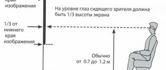
If you have a standard room with a sofa and a couple of armchairs (and not a theater room with several rows of chairs), then the screen should be hung at a height of 61-92 cm from the floor
If the projection ratio is 3:1 (three to one), and the screen size is 200 centimeters, then the distance between the product and the wall should be 3 × 200 (multiply the projection ratio by the size). This is the recommended value. Focus more on your perception. If you are not happy with the picture, move the projector.
The vertical offset determines the height at which the projection equipment should be located. This parameter is indicated as a percentage. Some people place the playback device on the floor, some on the nightstand, some hang it from the ceiling. If the vertical offset has a plus sign (for example, +90%), the image will be higher than the device. If with a minus sign (-91%) - lower. Some models allow you to rotate the lens.
Correct installation of the screen is also an important point. Of course, this largely depends on the situation in the room. Projection equipment should be positioned so that you can watch movies comfortably. But you still need to follow some recommendations.
- Do not project the screen onto a wall that is exposed to direct light. Even a good and properly configured projector will show poorly if the room is very bright.
- There should be no foreign objects between the device lens and the wall. If you decide to place the product behind the audience, be aware that their heads may block part of the frame.
- The closer the lens is to the wall, the brighter the image. But this reduces clarity. Turn on your projection equipment to see what the final picture will look like. Without such a check, it is impossible to select the projector’s resolution, contrast and other parameters.
- Find a position so that the projection hits the screen directly. If necessary, place the device higher or lower. Sit in the place from which you will watch the video. Check whether everything is clearly visible, whether shadows from objects or glare are interfering.
- If you are hanging the device from the ceiling, use a special mount.
- Decide in advance where the wires will be located and whether they are long enough.
Computer version of projector calibration
Using a projector, if desired, you can replace a computer monitor, but it can also be used in combination with the latter as an additional screen.
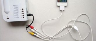
After connecting the device to the computer, you need to calibrate it.
To do this, you will have to use some programs to improve image quality. For example, it is very convenient to take an image into a grid and improve it in detail using just such software.
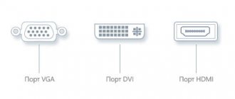
Quite often, to connect two devices, a VGA-DVI cable is required, as well as various additional adapters (their type is determined by the connectors necessary for synergy).
When the computer is already connected to the projector using the appropriate ports and wires, you need to open a window that allows you to configure the new equipment connected to your personal computer.
The setup process looks like this:
- Open the “Control Panel” through the “Start” menu or in another way convenient for you.
- In the “Design” section, go to the “Screen” item.
- Open a menu that allows you to manage screen settings.
- If the PC has already detected a new device connected to it, then you should see several desktops (most likely two), and an item indicating the presence of these additional screens.
- At this stage, it is necessary to indicate the required screen resolution, since in the future this will facilitate the process of adjusting the projector parameters.